Nutrack brand kit
Colours, typography and logo rules for web and mobile. One reference for every Nutrack surface.
The logo
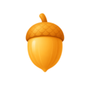
A cracked nut with an amber kernel: a raw idea opened into a plan. The mark plus wordmark is the primary lockup.
Colour palette
Ink
#161a24 · var(--background)
Primary surface
Shell
#242a37 · var(--surface)
Panels and cards
Kernel Amber
#f0b542 · var(--primary)
Primary action, logo kernel
Teal Sprout
#4fbccd · var(--accent)
Secondary accent, data
Confirmed Green
#4fc593 · var(--confirmed)
Verified facts
Sand
#f3f1ea · var(--foreground)
Body and heading text
Always reference the design tokens, never raw hex. Amber is reserved for primary actions.
Typography
Display · Sora 600
Crack the idea open
Body · Plus Jakarta Sans 400/500
Body copy at 14–16px, 165% line height, and a measure of no more than 75 characters.
Arabic · IBM Plex Sans Arabic
نيوتراك — الخط العربي بدون تتبع حرفي، مع اتجاه من اليمين إلى اليسار.
Do
- Keep the nut mark and wordmark on one baseline with a single-mark gap between them.
- Clear space around the lockup equals the height of the nut mark.
- Minimum sizes: 20px mark on web, 24pt mark on mobile, 16px in a favicon or app tile.
- On light surfaces use the ink wordmark; on dark surfaces use the sand wordmark.
- The mark may stand alone in app icons, avatars, loading states and the favicon.
Don't
- Don't recolour the kernel — amber is the only kernel colour.
- Don't stretch, rotate, outline or add shadows to the mark.
- Don't place the lockup on a busy photo without an ink scrim.
- Don't rewrite the name: it is always "Nutrack", one word, capital N.
- Don't substitute another nut illustration or emoji for the mark.